1. List:
Elements can be found in data.html
Using charts.js
radarChartTwelvelineChartTwelveradarChartMainFourradarChartAcledhistogramChart,VAChistogramChartPRIOhistogramChart
Using echarts.js
eventscatterplotChart,acledAdm2scatterplotChart,actorscatterplotCharteventSankeyDiagramactorsChord
2. Graphs
Note: The first graph function contains the complete code. For the subsequent graphs, only specific parts focusing on details will be included
a. Static charts
radarChartTwelve
Function: createFSIRadarChart
Library: chart.js
Variables:
-
fsi_def : data.fsi_def: table fsi_definitions
-
data: data.fsi_allyear: table fsi_exports
-
canvasId : "radarChartTwelve"
Description: Displays the first and last year of the FSI dataset for the selected country on a radar chart, across the 12 dimensions. When clicking on one of the points, it will create another graph displaying the time evolution of this indicator.
Code extract: Extract first and last values, wrapped labels, call for another function when clicked
    // Map column name and indicator name
    const columns = fsi_def.map(item => item.col_name);
    const labels= fsi_def.map(item => item.indicator_name);

    // Check if data is valid
    if (!Array.isArray(data) || data.length === 0) {
        console.error('Invalid data: Data is empty or not an array');
        return;
    }

    // Find the first and last year_fsi in dataset
    const firstYearData = data.reduce((first, current) => {
        return (current.year_fsi < first.year_fsi) ? current : first;
    }, data[0]);

    const lastYearData = data.reduce((last, current) => {
        return (current.year_fsi > last.year_fsi) ? current : last;
    }, data[0]);

    // Extract the values for the each column
    const firstYearValues = Object.keys(firstYearData)
        .filter(key => columns.includes(key))
        .map(key => firstYearData[key]);

    const lastYearValues = Object.keys(lastYearData)
        .filter(key => columns.includes(key))
        .map(key => lastYearData[key]);

    const cty = document.getElementById(canvasId).getContext('2d');
    // Wrap the labels to fit the chart (2 lines)
    const wrappedLabels = labels.map(label => {
        return label.split(' ').reduce((acc, word) => {
            if (acc.length === 0) {
                acc.push(word);
            } else {
                const lastLine = acc[acc.length - 1];
                if (lastLine.length + word.length + 1 <= 20) {
                    acc[acc.length - 1] = `${lastLine} ${word}`;
                } else {
                    acc.push(word);
                }
            }
            return acc;
        }, []);
    });
    const chartConfig = {
        type: 'radar',
        data: {
            labels: wrappedLabels,
            datasets: [
                {
                    label: `${firstYearData.year_fsi}`,
                    data: firstYearValues,
                    backgroundColor: 'rgba(120, 29, 125, 0.01)',
                    borderColor: 'rgba(120, 29, 125, 0.8)',
                    borderWidth: 1,
                    borderDash: [5, 5] // Add dashed border
                },
                {
                    label: `${lastYearData.year_fsi}`,
                    data: lastYearValues,
                    backgroundColor: 'rgba(0, 69, 128, 0.5)',
                    borderColor: 'rgba(0, 69, 128, 1)',
                    borderWidth: 2
                }
            ]
        },
        options: {
            layout: {
                padding: {
                    top: 0,
                    bottom: 0,
                    left: 0,
                    right: 0
                }
            },
            scales: {
                r: {
                    beginAtZero: true,
                    pointLabels: {
                        font: {
                            size: 10
                        }
                    },
                    suggestedMax: 10,
                    grid: {
                        circular: true // Ensure the grid is circular
                    }
                }
            },
            plugins: {
                legend: {
                    display: true,
                    maxHeight: 30
                },
                tooltip: {
                    callbacks: {
                        label: **Function**(context) {
                            const colName = columns[context.dataIndex];
                            const value = context.raw;
                            const fsiDefItem = fsi_def.find(item => item.col_name === colName);
                            const description = fsiDefItem ? fsiDefItem.indicator_description : '';
                            text = `${value} ${description} `;
                            return text.match(/.{1,50}/g); // Break into lines of 20 chars
                        }
                    }
                }
            },
            // Add event listener for click event
            // Create Line chart displaying the time evolution of the selected indicator
            onClick: **Function**(event, elements) {
                if (elements.length > 0) {
                    const index = elements[0].index;
                    const label = labels[index];
                    const colName = columns[index];
                    createFSILineChart(data, colName, label, 'lineChartTwelve');
                }
            }
        }
    };
    new Chart(cty, chartConfig);
lineChartTwelve
Function: createFSILineChart
Library: chart.js
Variables:
-
data: table fsi_exports
-
colName: Selected indicator column
-
label: Selected indicator cleaned name
-
canvasId: 'lineChartTwelve'
Description: Displays the time evolution of the indicator selected on the 12-dimension FSI Radar Graph.
Code extract: how to update a chart with an onclick event: destruct and reconstruct a chart instance.
    // Destroy existing chart instance if it exists
    if (window.lineChartInstance) {
        window.lineChartInstance.destroy();
    }

    // Create new chart instance
    window.lineChartInstance = new Chart(ctx, chartConfig);
radarChartMainFour
Function: createFSIRegionRadarChart
Library: chart.js
Variables:
-
fsi_def : from table fsi_definitions
-
data: data.fsi_region2024: query2a in Function get_data in app.py: calculate region average
-
fsi_categories : from table fsi_categories
-
canvasId : "radarChartMainFour"
Description: Displays the aggregated FSI dataset on 4 dimensions (Cohesion , Economy, Social, Political) for the selected country, and the average for the region on a radar chart.
Code extract:calculate the mean for every indicator category (Cohesion , Economy, Social, Political)
   // **Function** to calculate the mean of values in the specified columns
    **Function** calculateMean(data, columns) {
        const values = columns.map(column => data[column]);
        const sum = values.reduce((acc, value) => acc + value, 0);
        return (sum / values.length).toFixed(2);
    }

    // Calculate the mean for each fsi_def indicator category for each region
    const regionMeans = data.map(regionData => {
        return fsi_def.reduce((acc, indicator) => {
            const columns = fsi_def
                .filter(item => item.indicator_category === indicator.indicator_category)
                .map(item => item.col_name);
            const mean = calculateMean(regionData, columns);
            acc[indicator.indicator_category] = mean;
            return acc;
        }, {});
    });
radarChartAcled
Function: createAcledIndexRadarChart
Library: chart.js
Variables:
-
data: from table acled_index
-
def : from table acled_index_def
-
columns: ["deadliness_value_scaled", "diffusion_value_scaled", "danger_value_scaled", "fragmentation_value_scaled"]
-
canvasId : "radarChartAcled"
Description: Display the ACLED conflict index 4 dimensionusing the updated scaled value (log(value)/log(max) on a radar chart. Currently, scaled values are used, but real values could be implemented later. The selected columns are kept for this purpose.
Code extract: Plugin creation and open the relevant tab
   // Create plugin with color area in background
   const backgroundZonesPlugin = {
        id: 'backgroundZones',
        afterDraw(chart, args, options) { // Use afterLayout instead of beforeDatasetsDraw
            const { ctx, scales } = chart;
            const r = scales?.r; // Ensure r exists before using it

            if (!r || !r.getPixelForValue) {
                console.error('r scale is not properly initialized');
                return;
            }

            const centerX = chart.width / 2;
            const centerY = chart.height / 2;

            const zones = [
                { max: 0.25, color: 'rgba(44, 162, 95, 0.25)' },
                { max: 0.5, color: 'rgba(246, 198, 4, 0.25)' },
                { max: 0.75, color: 'rgba(223, 88, 58, 0.25)' },
                { max: 1, color: 'rgba(151, 49, 49, 0.25)' }
            ];

            zones.forEach((zone, index) => {
                const previousMax = index === 0 ? 0 : zones[index - 1].max;
                const innerRadius = index === 0 ? 0 : r.getDistanceFromCenterForValue(zones[index - 1].max);
                const outerRadius = r.getDistanceFromCenterForValue(zone.max);
                ctx.beginPath();
                ctx.arc(centerX, centerY, outerRadius, 0, 2 * Math.PI);
                ctx.arc(centerX, centerY, innerRadius, 0, 2 * Math.PI, true);
                ctx.closePath();
                ctx.fillStyle = zone.color;
                ctx.fill();
            });
        }
    };


   // Open relevant tab when clicking on a radar chart element
   onClick: **Function**(event, elements) {
                if (elements.length > 0) {
                    const index = elements[0].index;
                    const label = labels[index];
                    const tabId = `#${label.toLowerCase()}`; // Convert label to lowercase and use as tab ID
                    const tabButton = document.querySelector(`[data-bs-target="${tabId}"]`);
                    if (tabButton) {
                        const tab = new bootstrap.Tab(tabButton);
                        tab.show();
                    }
                }
            }
b. Dynamic Charts
These charts are updated with the ACLED dataset filters, such as when zooming or moving on the map and filtering over time.
They are called by the function updateVisualizations(globalFilteredData,map,actorsData)
histogramChart, VAChistogramChart
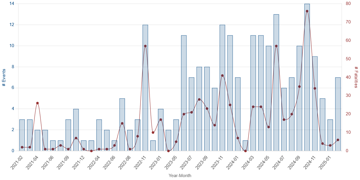
Function: createHistogram
Library: chart.js
Variables:
-
data: filteredData or civilianTargetingData (same but filtered to collect only Civilian Targetting)
-
canvasId : "histogramChart", "VAChistogramChart"
Description: Displays an histogram with both number of events and Fatalities in a combined line and bar graph, using 2 y-axes
Code extract: Aggregating by month and year and instance management for 2 different charts
    // Group the data by year-month,  chart configuration with 2 y axis, making the line smooth and calculate the number of events and fatalities
    features.forEach(feature => {
        const date = new Date(feature.properties.event_date);
        const month = date.getFullYear() + '-' + ('0' + (date.getMonth() + 1)).slice(-2);

        if (!monthlyData[month]) {
            monthlyData[month] = { events: 0, fatalities: 0 };
        }

        monthlyData[month].events += 1;
        monthlyData[month].fatalities += feature.properties.fatalities;
    });

    chartConfig={
        type: 'bar',
        data: {
            labels: labels,
            datasets: [
                {
                    type: 'bar',
                    label: '# Events',
                    data: eventsData,
                    backgroundColor: 'rgba(0, 69, 128, 0.2)',
                    borderColor: 'rgba(0, 69, 128, 0.8)',
                    borderWidth: 1,
                    yAxisID: 'y'
                },
                {
                    type: 'line',
                    label: '# Fatalities',
                    data: fatalitiesData,
                    backgroundColor: 'rgba(151, 49, 49, 1)',
                    borderColor: 'rgba(151, 49, 49, 1)',
                    borderWidth: 1,
                    cubicInterpolationMode: 'monotone',
                    tension: 0.4,
                    fill: false,
                    borderDash: [5, 5],
                    yAxisID: 'y1',
                }
            ]
        },
        options: {
            responsive: true,
            maintainAspectRatio: true,
            plugins: {
                legend: {
                    display: false
                }
            },
            scales: {
                x: {
                    beginAtZero: true,
                    title: {
                        display: true,
                        text: 'Year-Month'
                    },
                    grid: { display: false }
                },
                y: {
                    beginAtZero: true,
                    title: {
                        display: true,
                        text: '# Events',
                        color: 'rgba(0, 69, 128,1)'
                    },
                    ticks: {
                        color: 'rgba(0, 69, 128,1)'
                    }
                },
                y1: {
                    type: 'linear',
                    display: true,
                    position: 'right',
                    grid: {
                        display: false,
                     },
                    title: {
                        display: true,
                        text: '# Fatalities',
                        color: 'rgba(151, 49, 49,1)'
                    },
                    ticks: {
                        color: 'rgba(151, 49, 49,1)'
                    }
                }
            },

            onClick: (event, elements) => {
                if (elements.length > 0) {
                    const index = elements[0].index;
                    const selectedMonth = labels[index];
                    filterByMonth(features, selectedMonth);
                }
            }
        }
    };

    // Destroy the existing chart instance if it exists
    if (canvasId==='histogramChart') {
        if (histogramChartInstance) {
            histogramChartInstance.destroy();
        }
        histogramChartInstance =new Chart(ctx, chartConfig);
    }
    if (canvasId==='VAChistogramChart') {
        if (VAChistogramChartInstance) {
            VAChistogramChartInstance.destroy();
        }
        VAChistogramChartInstance =new Chart(ctx, chartConfig);
    }
eventscatterplotChart, acledAdm2scatterplotChart, actorscatterplotChart
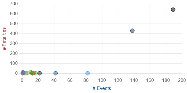
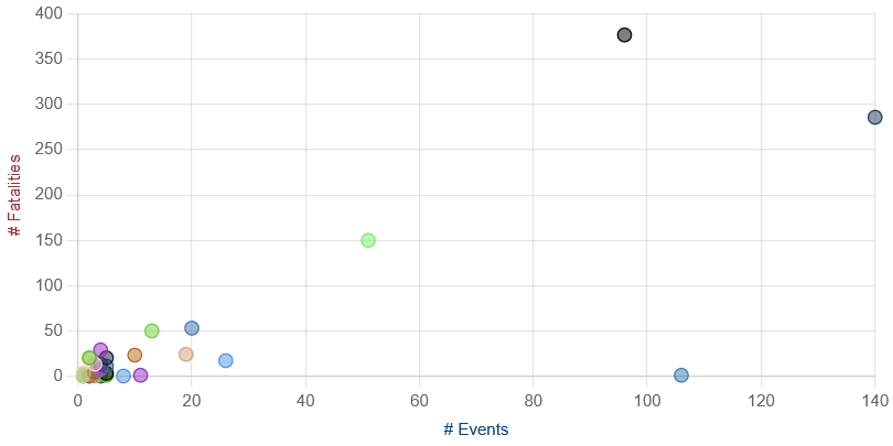
Function: createScatterplot
Library: echarts.js
Variables:
-
features: filteredData
-
canvasId : "eventscatterplotChart", "acledAdm2scatterplotChart","actorscatterplotChart"
-
dimension: "sub_event_type","admin2", "actor1"
Description: Creates scatterplots showing the number of events and fatalities classified by the selected dimension.
Code extract: and quadrant plugin to divide in 4 categories (unused)
    // Group data by the dimension and aggregate # events and # fatalities
        const groupedData = scatterData.reduce((acc, item) => {
            if (!acc[item.label]) {
                acc[item.label] = { events: 0, fatalities: 0 };
            }
            acc[item.label].events += 1;
            acc[item.label].fatalities += item.y;
            return acc;
        }, {});

        // Prepare datasets for the scatter plot
        const datasets = Object.keys(groupedData).map((key, index) => ({
            label: key,
            data: [{ x: groupedData[key].events, y: groupedData[key].fatalities }],
            backgroundColor: `rgba(${index * 30 % 255}, ${index * 60 % 255}, ${index * 90 % 255}, 0.5)`,
            borderColor: `rgba(${index * 30 % 255}, ${index * 60 % 255}, ${index * 90 % 255}, 1)`,
            borderWidth: 1,
            pointRadius: 5
        }));

                // Calculate max values for quadrants
        const maxX = Math.max(...datasets.map(d => d.data[0].x));
        const maxY = Math.max(...datasets.map(d => d.data[0].y));
        const halfMaxX = maxX / 2;
        const halfMaxY = maxY / 2;

        // Define the quadrants plugin
        const quadrantsPlugin = {
            id: 'quadrants',
            beforeDraw: (chart) => {
                const { ctx, chartArea: { left, right, top, bottom, width, height } } = chart;
                ctx.save();

                // Define the quadrants
                const quadrants = [
                    { label: 'Minor Threats', color: 'rgba(125,125,125, 0.1)', xMin: 0, xMax: halfMaxX, yMin: 0, yMax: halfMaxY },
                    { label: 'Persistant Threats', color: 'rgba(0, 69, 128, 0.1)', xMin: halfMaxX, xMax: maxX, yMin: 0, yMax: halfMaxY },
                    { label: 'Rare but Dangerous Threats', color: 'rgba(151, 49, 49,0.1)', xMin: 0, xMax: halfMaxX, yMin: halfMaxY, yMax: maxY },
                    { label: 'Destructive Threats', color: 'rgba(120, 29, 125, 0.1)', xMin: halfMaxX, xMax: maxX, yMin: halfMaxY, yMax: maxY }
                ];

                // Draw the quadrants
                quadrants.forEach(quadrant => {
                    ctx.fillStyle = quadrant.color;
                    ctx.fillRect(
                        left + (quadrant.xMin / maxX) * width,
                        top + (1 - quadrant.yMax / maxY) * height,
                        (quadrant.xMax - quadrant.xMin) / maxX * width,
                        (quadrant.yMax - quadrant.yMin) / maxY * height
                    );
                    // Draw the label in the middle of the quadrant
                    ctx.fillStyle = 'rgba(0, 0, 0, 0.5)'; // Adjust the text color as needed
                    ctx.font = '12px Arial'; // Adjust the font size and style as needed
                    ctx.textAlign = 'center';
                    ctx.textBaseline = 'middle';
                    ctx.fillText(
                        quadrant.label,
                        left + ((quadrant.xMin + quadrant.xMax) / 2 / maxX) * width,
                        top + (1 - (quadrant.yMin + quadrant.yMax) / 2 / maxY) * height
                    );
                });

                ctx.restore();
            }
        };

    }
eventSankeyDiagram
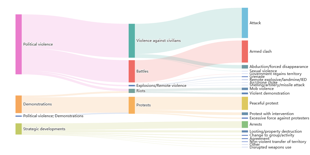
Function: createEventSankeyDiagram(features, canvasID)
Library: echarts.js
Variables:
-
data: filteredData (from map zoom and time filter)
-
canvasId : "eventSankeyDiagram"
Description: Creates a Sankey diagram linking disorder type, event type, and sub-event type to better understand their distribution.
Code extract: Create the nodes and links necessary, from disorder to event, and from event to subevent
    features.forEach(feature => {
        const props = feature.properties;
        const disorder = props.disorder_type || "Unknown Disorder";
        const event = props.event_type || "Unknown Event";
        const subEvent = props.sub_event_type || "Unknown Sub-event";

        // Add node names to the set.
        nodesSet.add(disorder);
        nodesSet.add(event);
        nodesSet.add(subEvent);

        // Build link from disorder -> event.
        const key1 = disorder + '->' + event;
        if (disorder !== event) {  // Only add if source and target differ
            if (key1 in linksDisorderToEvent) {
                linksDisorderToEvent[key1] += 1;
            } else {
                linksDisorderToEvent[key1] = 1;
            }
        }

        // Build link from event -> sub_event.
        const key2 = event + '->' + subEvent;
        if (event !== subEvent) {  // Only add if source and target differ
            if (key2 in linksEventToSubEvent) {
                linksEventToSubEvent[key2] += 1;
            } else {
                linksEventToSubEvent[key2] = 1;
            }
        }
    });

    // Convert the set to an array of node objects.
    const nodes = Array.from(nodesSet).map(name => ({ name }));

    // Convert link maps to an array.
    const links = [];
    Object.keys(linksDisorderToEvent).forEach(key => {
        const parts = key.split('->');
        links.push({ source: parts[0], target: parts[1], value: linksDisorderToEvent[key] });
    });
    Object.keys(linksEventToSubEvent).forEach(key => {
        const parts = key.split('->');
        links.push({ source: parts[0], target: parts[1], value: linksEventToSubEvent[key] });
    });
actorsChord
Function: createChordDiagram(features, canvasID)
Library: echarts.js
Variables:
-
data: filteredData (from map zoom and time filter)
-
canvasId : "actorsChord"
Description: Creates a chord diagram displaying interactions between actor categories (i.e. inter1, inter2). This could be improved by using associate actors, but would not be updated with the map.
Code extract: Create the nodes and links between actors category
        // Prepare the data for the chord diagram
    const interactions = features.map(d => ({
        inter1: d.properties.inter1,
        inter2: d.properties.inter2
    })).filter(d => d.inter2); // Filter out interactions where inter2 is empty or null

    const matrix = [];
    const indexByName = new Map();
    const nameByIndex = new Map();
    let n = 0;

    // Count the occurrences of each interaction
    interactions.forEach(d => {
        if (!indexByName.has(d.inter1)) {
            nameByIndex.set(n, d.inter1);
            indexByName.set(d.inter1, n++);
        }
        if (!indexByName.has(d.inter2)) {
            nameByIndex.set(n, d.inter2);
            indexByName.set(d.inter2, n++);
        }
    });

    // Initialize the matrix
    for (let i = 0; i < n; i++) {
        matrix[i] = Array(n).fill(0);
    }

    // Fill the matrix with the weights
    interactions.forEach(d => {
        const source = indexByName.get(d.inter1);
        const target = indexByName.get(d.inter2);
        matrix[source][target]++;
    });

    // Prepare the data for ECharts
    const categories = Array.from(nameByIndex.values());
    const nodes = categories.map((name, index) => ({
        id: index.toString(),
        name: name,
        symbolSize: 5*Math.log(matrix[index].reduce((a, b) => a + b, 0))+10, // Adjust the size as needed
        value: matrix[index].reduce((a, b) => a + b, 0), // Sum of interactions
        category: name // Adjust the category as needed
    }));

    const links = [];
    for (let i = 0; i < n; i++) {
        for (let j = 0; j < n; j++) {
            if (matrix[i][j] > 0) {
                links.push({ source: i.toString(), target: j.toString(), value: matrix[i][j] });
            }
        }
    }

    // Use the mis variable directly
    mis = {
        nodes: nodes,
        links: links,
        categories: categories.map((name, index) => ({ name: name }))
    };
PRIOhistogramChart
 Function:
 createPRIOlineChart(iso3, canvasID)
Library: chart.js
Variables:
-
iso3: country iso3 code
-
canvasId : "PRIOhistogramChart"
Description: Creates a line chart based on PRIO forecast data. The chart uses the latest model from the list in the api.
Code extract Fetch data from the last PRIO Forecast
// URL containing the list of models, extract the last one
const link = `https://api.viewsforecasting.org/fatalities002_2025_`+month+`_t01/cm/sb?iso=${iso3}`;
console.log('loading prio data:', link);
fetch(link)
    .then(response => response.json())
    .then(data => {
        // Extract labels and fatalitiesData from the fetched data
        console.log('prio data:', data);
        const labels = data.data.map(item => `${item.year}-${('0' + item.month).slice(-2)}`);
        const fatalitiesData = data.data.map(item => item.main_mean);
        // See code for real config
        const chartConfig = {}

        // Destroy the existing chart instance if it exists
        if (prioChartInstance) {
            prioChartInstance.destroy();
        }

        prioChartInstance = new Chart(ctx, chartConfig);
    })
    .catch(error => {
        console.error('Error fetching data:', error);
    });